Here’s the third post in our series on Direct Mail Best Practices. We’ve covered The List and The Message so far. Now, let’s talk about The Creative. Whatever shape your direct mail campaign takes, if it isn’t eye catching, you’ve wasted the entire effort.
So how can your direct mail campaign be eye catching? We can suggest a few tips that will help.
1. Killer Copy
Certainly, your message has to stand out in the way it’s written. The length of your content must be appropriate to the size of the finished piece. A letter needs more copy than a postcard, for instance. If your package includes an outer envelope, consider adding a teaser that creates intrigue. It’ll encourage the recipient to open the envelope, which is the first reaction you want.
Use keywords that studies have shown can act like triggers, motivating people to act. These include “eye magnet words,” like “Introducing,” “FREE,” and “Easy.” Personalization also boosts a direct mail campaign’s effectiveness, since seeing your name in print acts as an eye and ear magnet word.
Studies have also shown that a “PS” is a very powerful element in both B2B and B2C letters: it’s content that is read first. When producing a letter campaign, put important information in your PS.
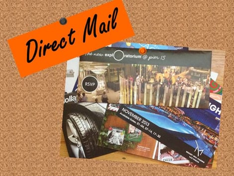
2. Strong Visuals
What images will help sell your product or service? Direct mail campaigns are strengthened by strong visuals, both photographs and other images, especially if you put them in spots that naturally attract the eye first. Ideally, you should test the images in your campaign. And knowing your audience – including whether or not it represents diverse cultures – should guide your creative team.
3. Careful Colors
Be aware that different colors have different effects on people. It’s part of a science known as “color psychology.” (Google the phrase and you’ll soon learn how advanced a science it truly is.) Colors evoke specific reactions, so choose your ink and paper colors carefully. Red is an extreme color, for example, both potent and intense. And blue is its opposite, symbolizing peace and tranquility. The colors you use in your print materials will help define your brand and should reinforce your particular message.
4. Skilled Layout
Don’t presume anyone with a Mac can design print materials. Involve a graphic designer in your direct mail campaign! How the content is displayed on your piece will improve or hurt its effectiveness, and only skilled designers should handle this function. Selecting the right typefaces for body and headline copy is critical. Hard-to-read fonts will ruin your campaign (using all caps for body copy, or using a font that’s too elaborate or fussy, for example, is not recommended). A designer will know how to integrate the copy with the visuals, how to balance type areas with white space, and where to place information on your printed piece. He or she will make sure the final piece is not only easy to read, but a delight to look at as well.
5. Effortless Simplicity
Your message and the layout should be simple and clean. Making too many points on one piece of direct mail will only confuse people. If your finished piece looks like a ransom note – too many typefaces and too many discrete visuals thrown together with no rhyme or reason – it’ll get tossed. Recipients won’t have a clue what you’re trying to sell, and you’ll only end up alienating them.
At the end of the day, pay attention to all of the creative aspects of your direct mail campaign. Involve your direct mail printer if you haven’t on-site resources of your own.
What should your mail recipients do next? That all depends on your call to action, which is what we’ll cover in our next post in this series. Don't miss it - subscribe to the blog top right of the page!